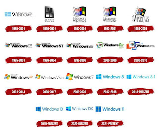
Windows Logo Evolution
The Windows logo has gone through several changes over the years since the first version of Windows was released in 1985.
Here's a brief overview of the evolution of the Windows logo:
Windows 1.0 (1985): The first Windows logo was a simple design consisting of two overlapping rectangles in different shades of blue.
Windows 2.0 (1987): The second version of the Windows logo featured a slightly more stylized design with the same two rectangles, but now in a lighter blue color and with a gradient effect.
Windows 3.0 (1990): The Windows logo was completely overhauled with the release of Windows 3.0. The new design featured a multi-colored window with four panes, giving the logo a more modern look.
Windows 95 (1995): With the release of Windows 95, the Windows logo underwent another major redesign. The new logo featured a stylized, 3D rendering of the window from the previous logo, with a blue, green, red, and yellow color scheme.
Windows XP (2001): The Windows logo for XP featured a simplified version of the previous design, with a flat, gradient-filled version of the four-pane window. The colors were also changed to a more subdued green and blue.
Windows Vista (2006): The Windows Vista logo featured a completely new design with a stylized flag made up of four squares in different colors. The colors used were a more muted blue, green, orange, and purple.
Windows 7 (2009): The Windows 7 logo was a variation of the Vista logo, with a more streamlined design and a slightly different color scheme.
Windows 8 (2012): With the release of Windows 8, Microsoft unveiled a new, flat design language called "Metro," and the Windows logo was updated to reflect this new style. The new logo featured a flat, monochromatic rendering of the window from previous designs.
Windows 10 (2015): The Windows 10 logo retained the same basic design as the previous version, but with a few subtle changes. The colors were brightened slightly, and the edges of the window were smoothed out for a more streamlined look.
Overall, the Windows logo has evolved over the years to reflect changes in design trends and technology. Please see attached cheatsheet
for reference:


No comments: